Above Skate Shop
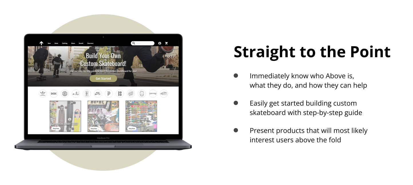
Above Skate Shop is an e-commerce store that specializes in custom skateboards. Above aims to provide an online shop for all skateboarding needs. But most of all, it helps users build a custom skateboard from beginning to end, no matter how knowledgeable you are on skateboards. So whether you’re a street skater, college student, or mom trying to buy a gift, Above provides all the information you need while ensuring a seamless user experience.
Design a flow to order custom skateboards online
Project
Summer 2022
Duration
Solo student project
Role
Users are not provided the needed information to confidently purchase the type of skateboard most suitable to them and their needs
PROBLEM
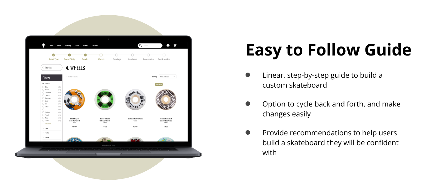
Design a seamless and informative flow to assist users in building a custom skateboard
SOLUTION
Research
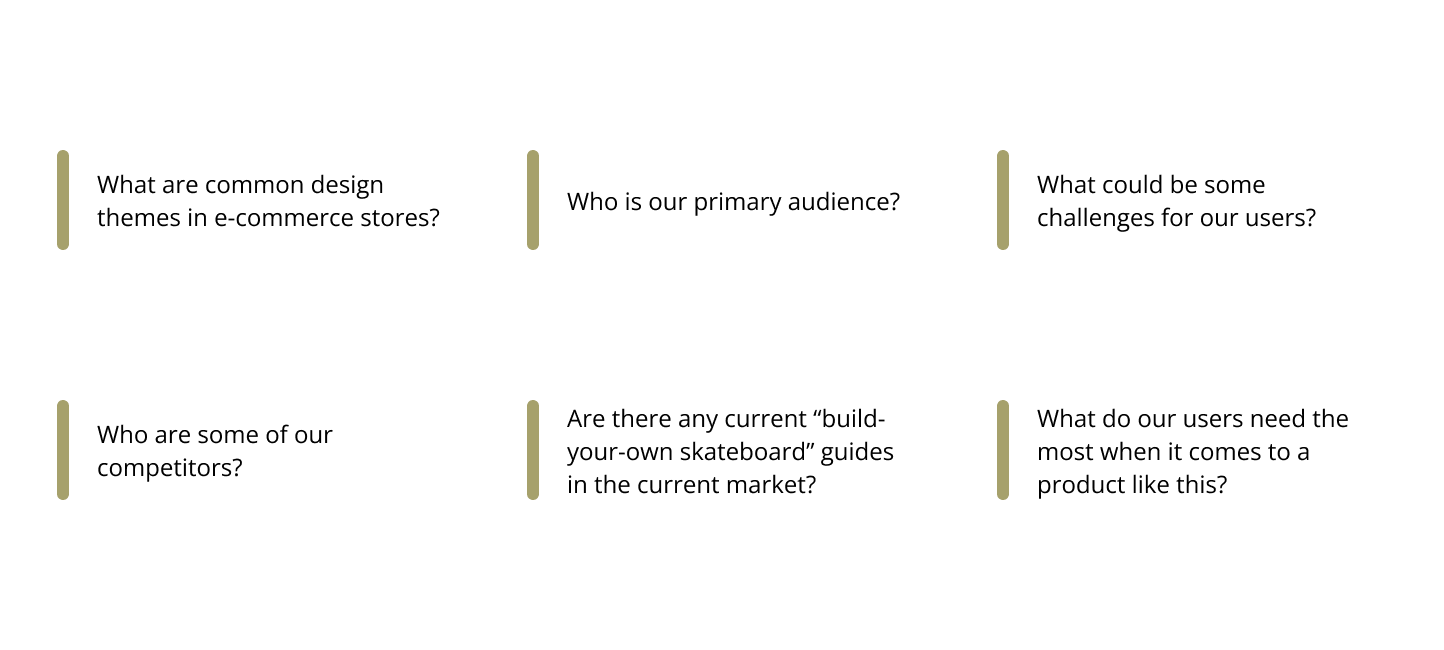
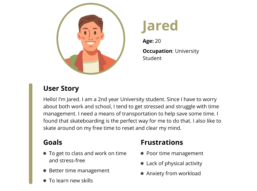
An early task for this project was to identify and understand potential users. I interviewed five participants with the goal of identifying pain points and establishing some user groups. A primary user group I identified were college students, with parents being a secondary user group. I then proceeded to identify pain points, create personas, create a user journey map, and conducted a competitive audit. Before all of this though, I kicked the project off by asking myself some initial key questions.
Pain Points
Meet the Users
User Journey Map
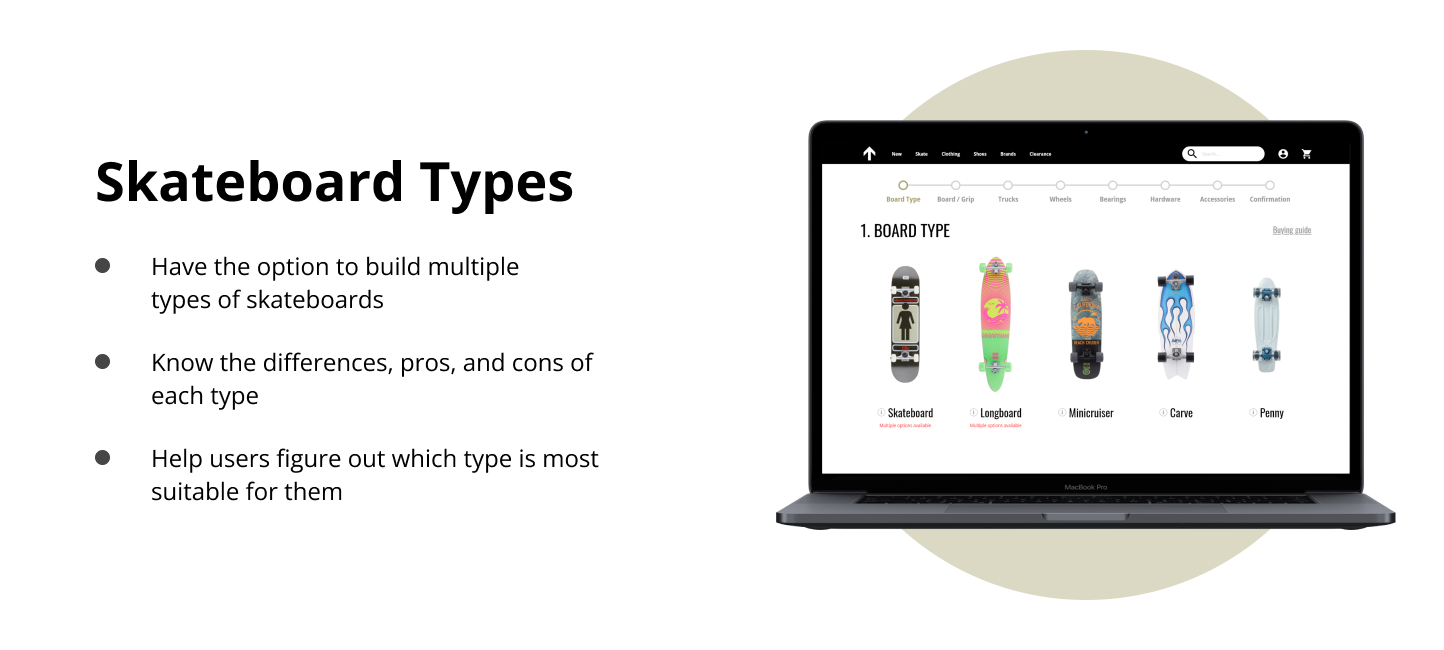
My goal with the journey map was to find some opportunities for improvement so that I could build the best obstacle free path that I could. A notable improvement included providing pros and cons of each skateboard type. This would help the user in selecting something that is meant for them. And ultimately, every other improvement and iteration would help contribute to that core goal.
Competitive Analysis
I took a look at several competing companies, being sure to include some of most well known online skate shops. The primary goal was to take a look and compare each competitors custom skateboard build guide. I wanted to find out what does and does not work when it comes to guides like these, and even see what maybe could help the user in a way they may not have thought of.
Each competitor had their own unique custom building guide, but my main takeaways were:
Interfaces can be distracting and confusing
There are either no buying guides or it is practically unfindable
Competitors expect you probably already know what you are doing
Limitations on types of skateboard to build
Aim to simplify interactions
Starting the Design
Preparing the Journey
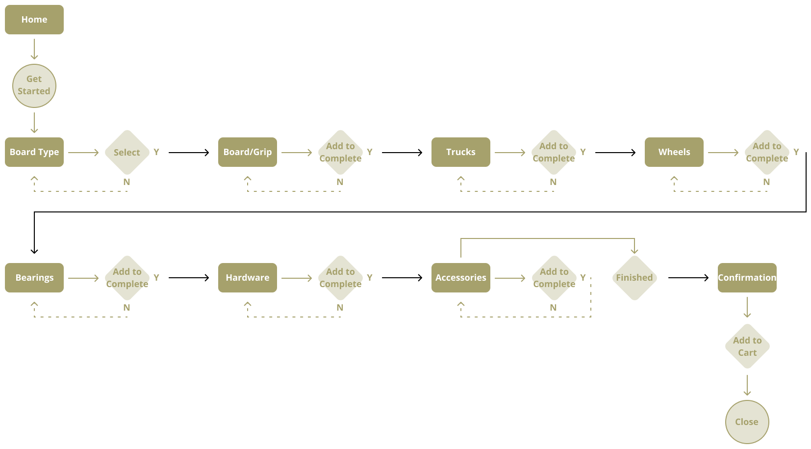
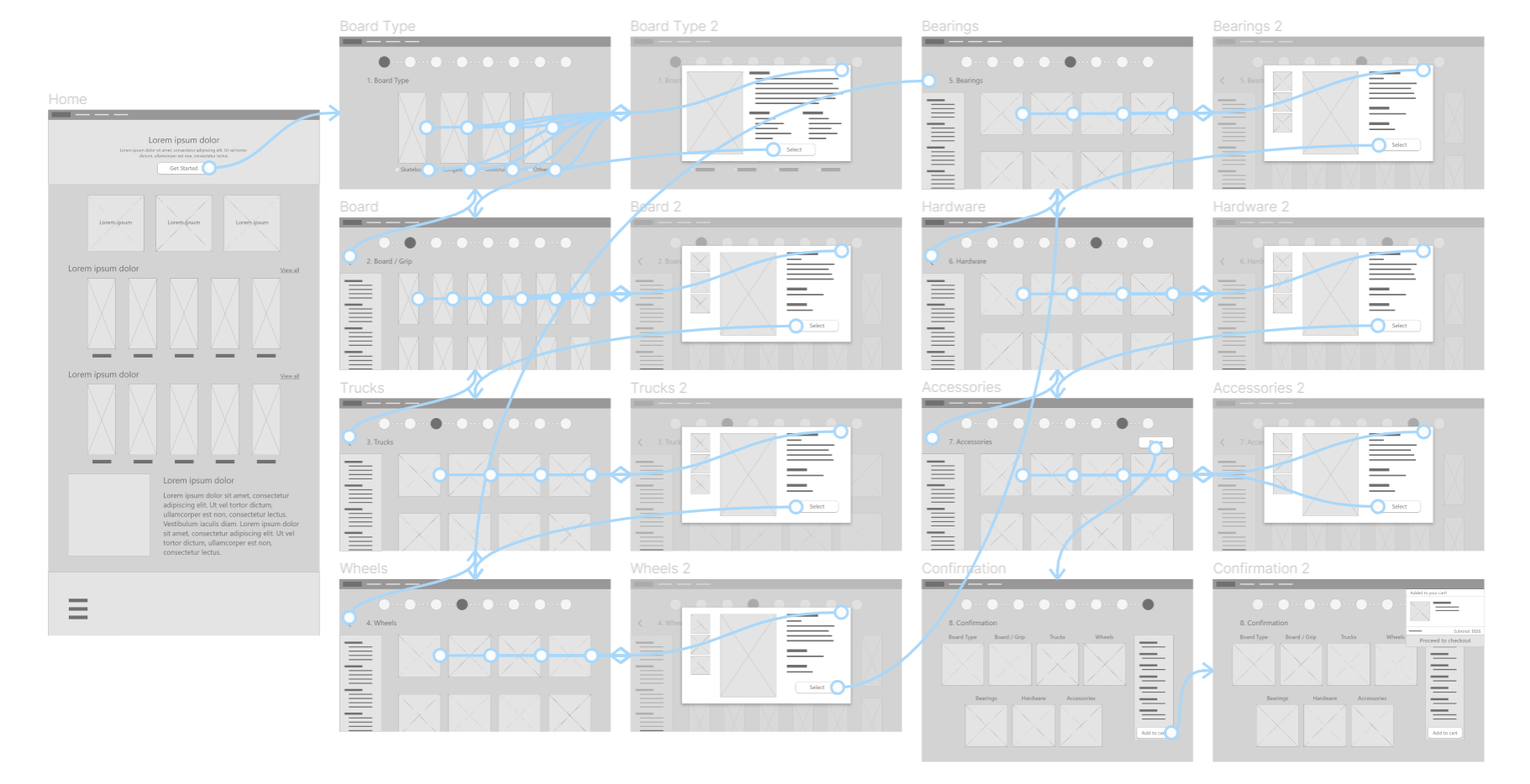
I constructed a user flow of what the standard start to finish journey would look like when a user is building a custom skateboard… For the most part, I wanted to keep the flow linear. The intent is so that users can know exactly what they are building product by product. As opposed to a flow where users can just pick whatever part of their board they want, you cant make the mistake of picking products that would be incompatible with each other.
Information Architecture
Paper Wireframes
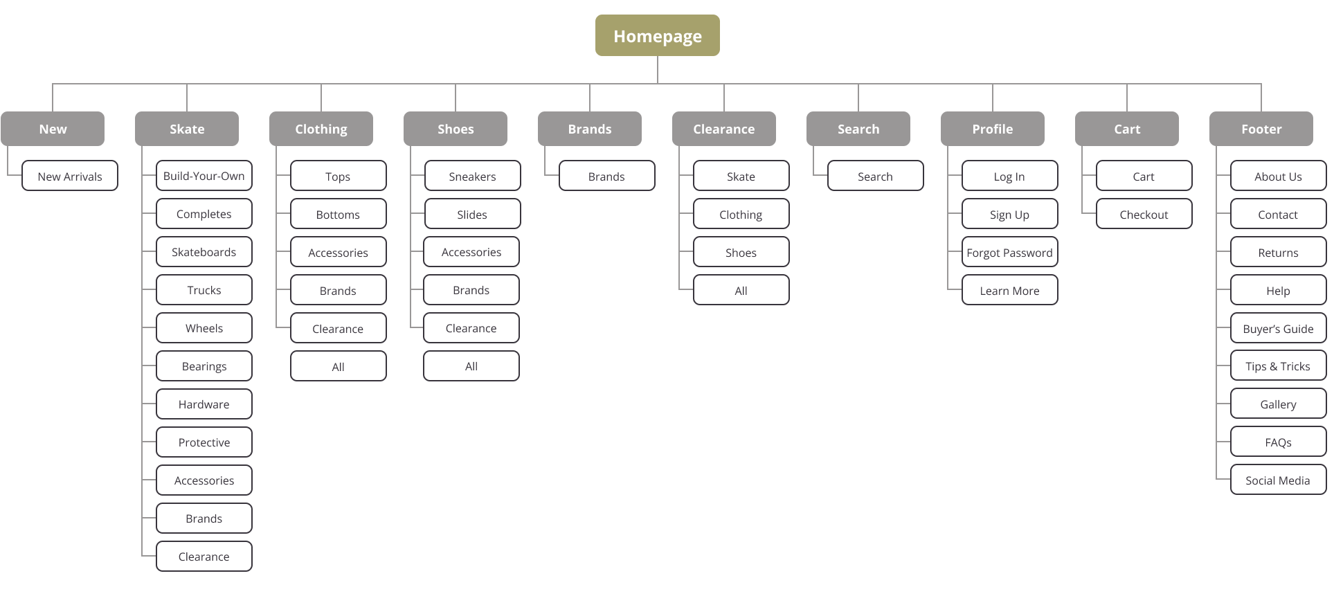
While the main aspect of the project was to design a flow to order custom skateboards, I knew it was going to be grounded in an e-commerce store. So, I wanted to be able to understand some of the rules and common themes when it comes to the design of e-commerce stores, in order to provide a familiar way of navigation for the users.
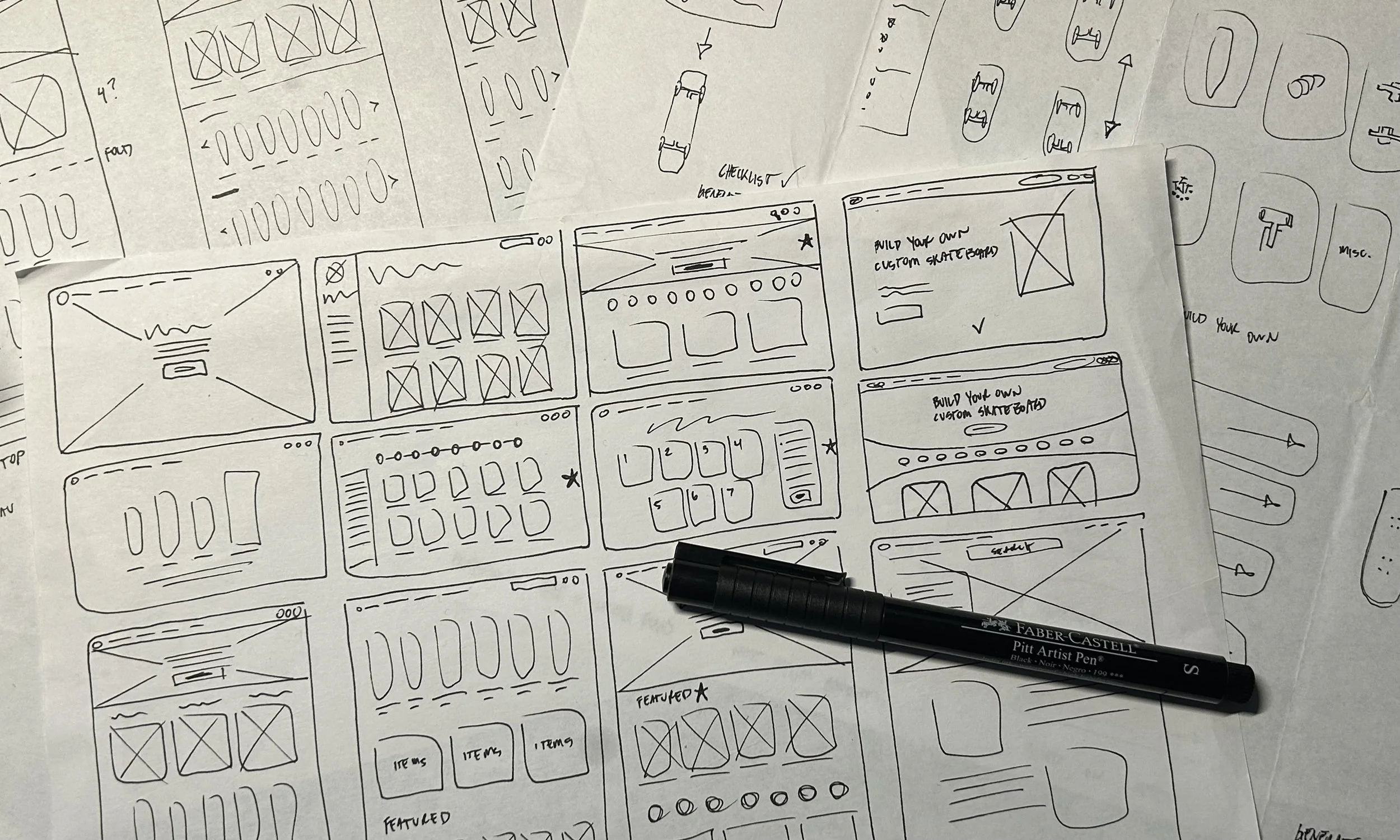
As far as the flow itself, I wanted to make sure it could take care of users that do not necessarily know what makes a good, fitting skateboard. For example, users who would not know the size skateboard they need, or the kind of wheels that will work the best on the terrain they will mostly be on, etc. But, I also wanted to make sure I provided everything for a user who does know exactly what they are doing when building a skateboard.
Stars were used to mark the elements of each sketch that I planned to use in the initial digital wireframes.
Digital Wireframes + Low Fidelity Prototype
After sketching some paper wireframes and committing to some elements, I created digital wireframes and a low-fidelity prototype. When it came to the flow to order custom skateboards, I reviewed what was absolutely necessary, then looked at how I could simplify things, and also, what could be improved.
Refining the Design
Testing + Improvements
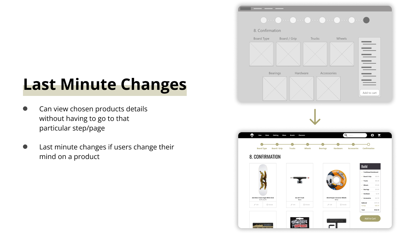
I conducted two rounds of usability studies. I used the findings from the first round to create better mockups and a high-fidelity prototype. I then ran a second round of usability studies afterward and continually iterated my design. Here were some improvements:
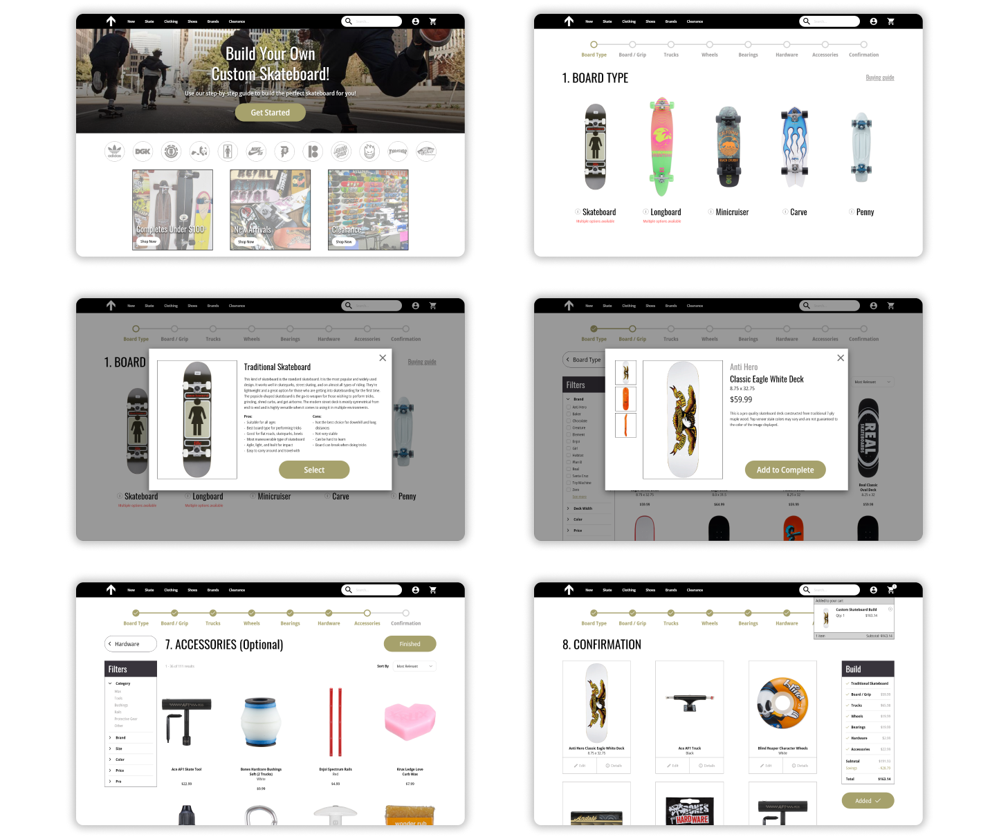
The Final Product
Takeaways
Although this was only my second project in UX design, I felt a lot more comfortable going through the design thinking process. Being new to the field, the first project felt discouraging at times because I would overthink myself. With this one though, I was able to get more into a groove.
1.) Importance of grids / structure - In the beginning of the design phase, I made the mistake of not using a grid. I eventually added one to the screens I was working on, and realized how out of order the design was. It is easy to just place elements on a screen and think it looks fine. But now I know that universally, good UI's need and have a structure. So, I will always use a grid in my designs, remembering their importance and benefits.
2.) Work smarter, not harder - It was fun getting experience with another design tool, that being Adobe XD. We used Figma for the first project. I realized the importance of working smarter, not harder, by utilizing the tools within these applications.
3.) Web Design - With this being my first go at website design, I knew there was going to be some new rules that I had to learn and understand. But despite that, I am satisfied with the final product. Even though I have a lot more to learn, I appreciate these kinds of learning experiences and realize they are building blocks.
