GoodEATS
GoodEATS is an online cookbook tool, designed for people new to technology. GoodEATS aims to offer an eclectic range of recipes that are straightforward and easy enough to follow. A few of the products offerings include recipes, cooking and baking tips, merchandise, grocery lists, and more. So whether you’re a person new to technology or an experienced user, GoodEATS will have you covered, confident, and well fed.
Project
Cook book tool for people new to technology
Fall 2022
Duration
Solo student project for Google UX Design Certificate
Role
Cookbook tools can be unreliable and overwhelming, discouraging users from trying to cook, or continuing to cook
PROBLEM
Design a cross-platform cookbook tool for GoodEATS that is easy to use, even for people new to technology
SOLUTION
Process
Research
Starting off, I conducted some secondary research. I took a brief look at prominent apps, sites, and even books that are currently on the market. I wanted to gather any valuable information I could such as what was helpful as well as what was not working for users. I devised some early questions to ask myself to get started on the right foot and confidently. I proceeded to conduct primary research and started with user interviews.
Pain Points
Meet the Users
User Journey Map
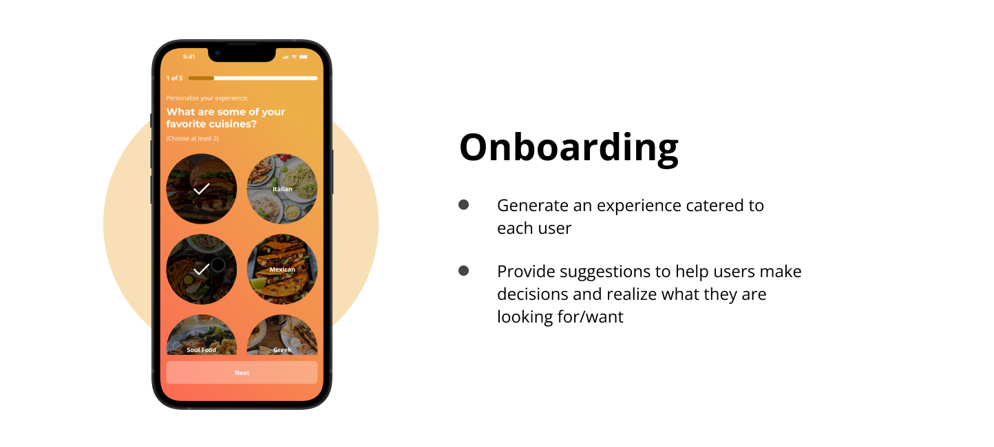
Creating this typical user journey helped me envision how a user would accomplish the goal of finishing a recipe, and anything else in between. The goal was to uncover any opportunities for improvement that I may not have considered before. I had to keep in mind that I was primarily designing for a person that is new to technology, so I did not want to suggest anything confusing. A notable opportunity included options for recipes (i.e., meals under 30 minutes, trending meals, etc.). This would suggest recipes to users, ultimately helping them in deciding what they want to make.
Competitive Analysis
To establish a good foundation for GoodEATS, I took a look at several competing companies. I wanted to see what was working well and if there were any kind of user goals not being reached. Since the project involved designing both a dedicated mobile app and a responsive website, I had to make sure to consider both ends when selecting companies. For Yummly and Tasty, I looked at their apps. For Allrecipes, Food Network, and Epicurious, I looked at their websites.
When reviewing all these companies, the first thing I tried to figure out was what I could capitalize on. Most features were very similar amongst the competitors, but some of my main takeaways were:
Omitting features like news, articles, etc.
Capitalizing on vital features like shopping lists and collections
Loud / Distracting interfaces vs. minimalistic
Phone or tablet usage would be much easier
Ideation
When ideating on design solutions, I started with crazy eight exercises. I can tend to overthink my designs so crazy eights is a great way for me generate more solutions without thinking too hard about it. I had some early design ideas but a lot of them changed after researching. My primary goal was to find a way to implement the must have features while still keeping it simple enough to use, especially for people new to technology.
Starting the Design
Preparing the Journey
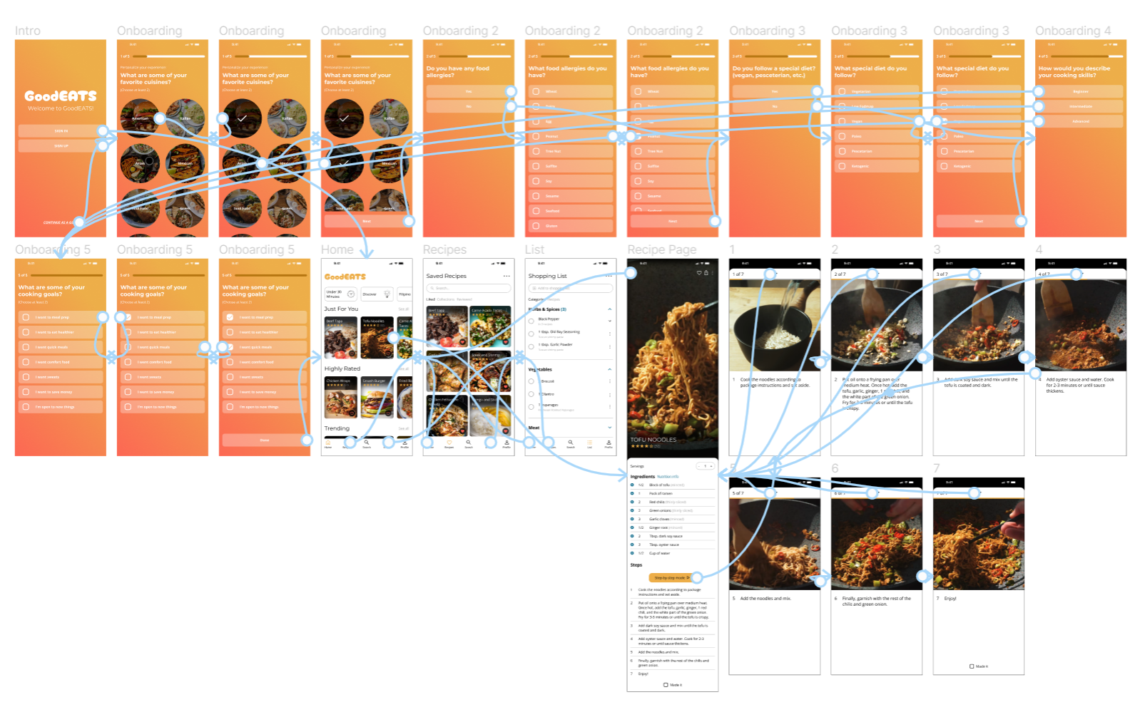
I constructed a user flow of the standard start to finish journey. The primary goal for a user would be to select, follow, and complete a recipe. Secondary goals would be utilizing the search, recipes, and shopping list features. The shopping list would serve as a grocery list. The list also has other helpful features like letting users know what recipe(s) uses that particular ingredient. The search feature would help users by suggesting ideas or using filters to help them make a decision on what to make, helping to prevent drop-off rates.
Information Architecture
Paper Wireframes
After ideating on design solutions, creating a user journey, and establishing the IA, I was able to steer my design into a better direction. I now had a more coherent vision on what elements I wanted to incorporate. I just had to figure out how to put it all together in a presentable, user-friendly way.
Digital Wireframes + Low Fidelity Prototype
Refining the Design
I continued to iterate my design and conduct additional research. I also conducted two rounds of usability studies. I used the findings from the first round to create better mockups and a high-fidelity prototype. I then ran a second round of usability studies afterward. Here were some improvements:
Testing + Improvements
The Final Product
The Style Guide
Takeaways
With this being my third and final project for the Google UX design certificate, I took a moment to reflect on how the journey has been thus far. Although I did learn a lot, I know I still have a lot more to learn. Despite that, I believe that through this program, more studying, and more practice, I'll be on the verge of building a solid foundation for myself. It does not stop here for me!
When reflecting on this particular project, some of my main takeaways were:
1.) Establishing consistency (progressive enhancement) - The project before this one did involve responsive design, but we started with the website and then designed the mobile site. For this project, we took a progressive enhancement (bottom-up designing) approach. I found myself struggling when designing the website. When I was designing for mobile, I did not exactly think ahead as far as how I would scale up the design. My current design looked good on mobile and tablet, but not so much on web. Because of this, I had to scratch the design and reiterate. Personally, I found that it is easier to remove things than it is to add things. This is only between two beginner projects though so I can see how my point of view might change. Moving forward, I would either try designing from the top down or keep in mind early how I would make that mental leap into designing for larger screens.
2.) You're doing fine - As I moved along the design phase, I tended to notice mistakes in my UI and realized there were foundational UX problems in my design. I found myself getting discouraged and would also experience imposter syndrome. I took a break when this happened and reflected. I managed to pull myself together and process these feelings. I know this is all a part of the journey and learning experience. I just remind myself I'll be okay, and that I'm doing fine.


