Journey Coffee Co. Redesign
Journey Coffee Co. is a local coffee franchise with five shops across the Bay Area. They have built a solid community with many loyal customers. The quality of their coffee and food is great, matched only by the warmth, friendliness, and welcoming nature of their employees. The experience of visiting their shops is great every time you visit. But in the words of a customer, "The app is another story." Their app is underdeveloped and fails to meet user goals, so I completely revamped it.
Project
Redesign Journey Coffee Co.’s dedicated mobile app
Duration
Summer 2025
Role
Solo student project
Journey Coffee Co’s app is outdated, underdeveloped, and lacks key features to satisfy user needs, practically deeming it unusable
PROBLEM
Modernize the UI and UX of Journey Coffee Co’s app, and create a positive experience that aligns with their mission and values
SOLUTION
Process
Phase 1: Research
I kicked the project off by first asking myself a few questions. I figured out what the app was lacking, how the users felt, who some of the competitors were, and more. Ultimately, I was able to gain some quality insight early and prepare myself with confidence for the rest of the project.
Survey
In order to further understand the users, I conducted a 14-question survey. I managed to get responses from 48 participants ranging from the ages 16-57. Among other insights, some notable ones were:
Analyzing the App
The app’s unpleasant UI alone can be a reason for a redesign. But I wanted to know what was unpleasant about its UX. I took a moment to look at and break down the app, seeing what I wanted to focus on fixing later, as well as what users may struggle with.
Competitive Analysis
I took a look at 5 competing companies. I analyzed each app and also took myself down a standard user flow, looking for what I can capitalize on and improve, or even omit.
An app like Starbucks manages to captivate its users with its rewards system. They constantly present offers and give users opportunities to earn bonus points. On the contrary, an app like Philz manages to captivate its users with its innovative buying experience.
Some of my main takeaways were:
Categorization of product
Presentation of product
Features to be used at users disposal (helpful vs. distraction)
Time, steps, and effort to satisfy the primary user goal
Apps density
User Journey Map
Pain Points
Journey's app is already unusable because of its UI and UX, or lack thereof. That reason alone can remove the potential for having more users, and make it harder to retain its current ones.
In spite of that, I wanted to uncover what I could from the small group of users that did give the app a go. The main question I wanted to answer was what else is making it hard for users to accomplish their goals? Here is what I found:
Phase 2: Design
A concern for me when constructing the information architecture was the categorization of their menu. The way Journey constructs and labels its menu would not exactly be understood universally, not right away at least. I decided to keep the menu exactly the way they had it in store because I did not yet deem it a major problem. But, I made sure to keep this an area of focus when conducting user testing.
Information Architecture
User Flow
One thing I kept in mind when constructing the standard start-to-finish journey was when and how users would be using this product. I considered two things: Most users would use it in the morning, and will be in a rush. So I focused on making the flow as quick and efficient as possible.
Ideation
To ideate on design solutions, I did crazy eight exercises for the key pages. I took note of the elements I wanted to use when I moved on to paper wireframes. In order to keep the interface in line with what users are familiar with, I took a little bit of inspiration from a few of the competitors and incorporated them with my own ideas.
Low-Fidelity Explorations + Prototype
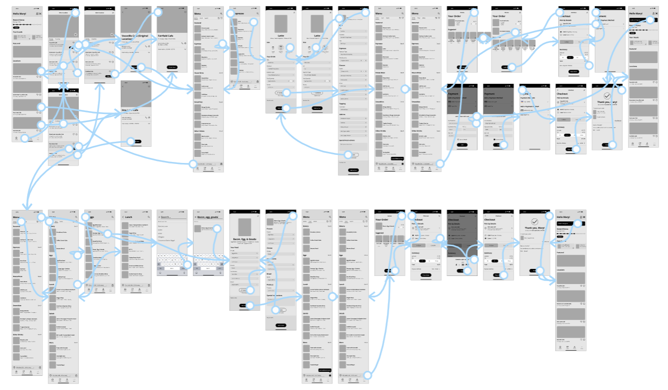
After going through some explorations and refining the direction I wanted to go, I proceeded to make digital wireframes and a low-fidelity prototype. I started by getting the foundational framework right and created screens for the primary user flow. Once I had that down, I gave it more depth.
I ran several participants through the low-fidelity prototype and gave them a few tasks to complete:
What time does the Fairfield cafe close?
How many calories are in a Bacon, Egg, & Gouda?
Order an Iced Vanilla Latte from the Vacaville cafe
Order a Bacon, Egg, & Gouda from the One Lake Cafe and schedule it for a 4:30 PM pickup
The tasks were pretty simple. I was more interested in understanding their interaction patterns and how they thought through the process of placing an order.
Usability Study
Improvements
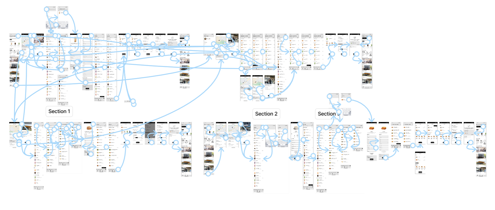
I was able to use the feedback I received from the usability study and make some improvements to my design. Among a few minor iterations, the most important one was reconstructing the menu.
The Final Product
The Style Guide
Edge Cases
If I were to go beyond the scope of this project, these were a few edge cases I considered at some point:
Takeaways
I found this project to be an excellent learning opportunity, and I thoroughly enjoyed the entire process. It marked my first attempt at a redesign project and was also my first project since completing the Google UX Design Certificate. Here are some of my main takeaways:
1.) Double Diamond - Unlike my previous projects, where I used the Design Thinking process, this time, I used the Double Diamond process. I went through the Double Diamond process smoothly and discovered that I favor it over Design Thinking. The workflow felt better for me, and it didn't feel as overwhelming.
2.) Auto Layouts - I was able to see the significance of utilizing auto layouts during this project. I dabbled with auto layouts before, but its usefulness became most evident to me here. I did not design too many screens in my previous projects, so at times I mistakenly felt like I could make do without it. But this time, I knew there was going to be a higher volume of screens and that I would make frequent changes. For my sake, I know it was a good thing I utilized it because it proved to be essential in maintaining design consistency.
3.) Redesign - Before even considering doing this project, I was hesitant because of my uncertainties about the processes and the approach. I realized I was just overthinking and finally decided to give it a try. I was able to see for myself the distinctions between redesigning a product and bringing one to life. In the end, this project not only added variety to my portfolio but also taught me valuable lessons.


